This template includes several advanced features, which means some parts may not be as straightforward to edit as others. This guide will help you make changes safely without accidentally breaking the design.
Homepage's Hero Image

Make sure the images in your homepage hero section have a 1:1 ratio to maintain consistent slider height.
Homepage's Hero Heading

The homepage Hero Heading (Display Heading) is quite large, so you may need to simplify product names to a maximum of two words. This helps maintain consistent slider height and ensures balanced spacing between the text and image.
Homepage's Hero Slider Interaction
The homepage product slider includes several elements affected by its slide interactions. These include the custom dot slider navigation (between the arrow buttons), the numbered slider navigation (bottom-right corner of the header), the background boxes behind the text and image, and the text button color below the main heading.
Avoid renaming or deleting the class names of these elements, as doing so can break the animations.
If you need to edit them, make sure to reassign the correct targets in the interaction settings afterward. This ensures all animations continue to work smoothly.
Note: some elements aren't working the way they intended, I've tried multiple ways to implement the animations, but nothing works. I believe this is a problem on Webflow's part as Slide interaction is rarely used, so they might have overlooked this feature.
The problem happens on the custom numbered slider nav, the number's color should turn white when that's the current slide.
Featured Products

The homepage includes a Featured Products section that displays up to four products marked as “Featured.”
To feature a product, open the Product Collection, select a product, and toggle “isFeatured” on.
Please note that product filtering by “Featured” is not available on the main product listing page. This is because Webflow’s native filtering options do not currently support combining category and featured filters at the same time.
As a result, the “Featured” field is only used for the homepage and won’t appear as an option in the product category dropdown menu.
Inspirations Images

In the Inspirations section, each slide contains three images. To maintain consistent layouts across all breakpoints, each image must have the correct aspect ratio.
Now, while CSS and Webflow both support the aspect-ratio property, I’ve found that it doesn’t always behave reliably within grid layouts. In some cases, images stretch back toward their original file ratio on certain breakpoints — causing uneven slide heights and layout issues.
To prevent this, make sure all images are cropped to the exact aspect ratios before uploading. Here’s what each image should use:
- Image 1 (bottom-right corner): 1:1 (Square)
- Image 2 (top): 3:4
- Image 3 (left): 5:3
The actual image size (e.g., 4K or 720p) doesn’t matter — only the aspect ratio does.
If you don’t have a dedicated photo editor, free apps like GIMP or PhotoScape X support custom aspect ratio cropping.
Alternatively, you can use Figma:
- Import your photo into your Figma project.
- Disable the “Maintain Aspect Ratio” option (next to the width/height fields).
- Set the width and height to your desired ratio (e.g., 3px × 4px).
- Re-enable “Maintain Aspect Ratio” and resize it back to your desired dimensions.
This quick trick ensures your image perfectly matches the needed ratio before you upload it to Webflow.
Inspiration Grid Bug
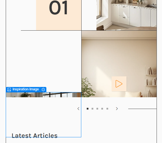
In the landscape mobile breakpoint, you might notice that the Inspirations section grid appears slightly off or “auto-balanced” inside Webflow Designer. This happens because the grid container has a custom aspect ratio applied to it, which limits how much it can stretch downward.
This is intentional — without the aspect ratio, the grid tiles would stretch unevenly, creating inconsistent gaps between the text and images (sometimes too large, sometimes too tight). The custom aspect ratio helps maintain a clean and balanced layout.
This issue only affects how the grid looks inside Webflow Designer — it displays correctly in both live preview and the published site.
Inspiration Videos

You might notice that one of the Inspiration images includes a play button. The videos themselves actually live outside the slider. Inside the Designer, there’s a container that holds all the videos — but only one is visible at a time (the video that belongs to the current slide).
Each video uses a combo class such as Video 1, Video 2, Video 3, and so on. This setup makes it easier to change, remove, or add videos as you adjust your number of slides.
To control which video appears, open the Interactions panel and set the video’s display style to Block or None when the corresponding slide comes into or out of view.
Home Hero & Testimonial Images
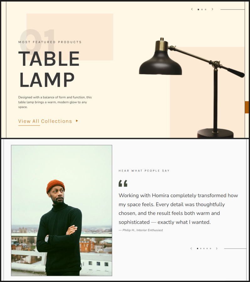
Both the Homepage Hero images and the Testimonial images (client portraits) aren’t actually placed inside their sliders — they’re controlled separately through Slide Interactions. The same applies to the custom Slider Nav Dots, which are also updated via these interactions.
To make editing easier, only the first image in each section is set to Static position, while the rest use Absolute positioning. This allows all following images to automatically match the resolution, position, and scaling of the first image without manual adjustments.
Similar to the Inspiration videos, each image uses a combo class such as Image 1, Image 2, Image 3, and so on. This helps you easily identify and target each image within the Interactions panel.
Product Reviews

Webflow doesn’t natively support product reviews, so I created a workaround using a regular CMS Collection. Each review item references a specific product from the Product Listing, and on each product page, the reviews are filtered to show only those linked to that product.
You’ll need to manually add each review to the Product Reviews CMS and manually update each product’s rating as well. While the review submissions can be automated using a plugin and a “Give Us Your Feedback” page with a connected form, those automations can only add or remove CMS items — they can’t modify related collections. Because of that, product ratings will still need to be updated manually whenever new reviews are added.
I hope this guide helps you navigate and customize the template with ease. Thank you for your time and trust.